Et Cetera

Miscellanea of technology, cognition,
and the philosophy of the future.
  • Home
  • Privacy Policy
  • Sample Page
  • Submit a Post!
  • Subscribe

Skip to content
  • Home
  • Privacy Policy
  • Sample Page
  • Submit a Post!
  • Subscribe

Tags

academia ai business centos code coding computer science css database design development digital nomad errors examples free future git guide hadoop html issues Java javascript learning linux productivity programming resources ruby school software software development software ventures solution SQL startups strings technology tips and tricks tool travel version control vertical web design web development

An Open Letter to Online Services

Posted on October 7, 2014 by Martin (Chaim) Berlove
Twitter: A nice, well-rounded landing page.

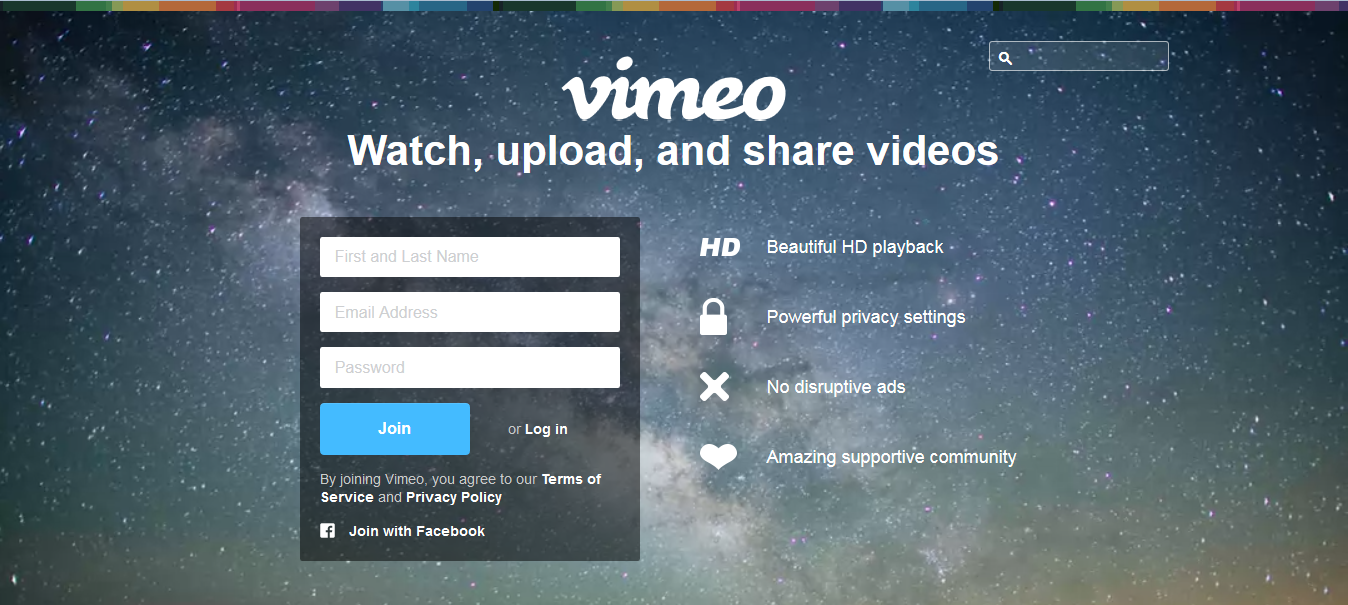
Nice, well-rounded landing page.


Dear [Generic Online Service],


I value your existence.


Without Dropbox, I wouldn’t have been able to print out that resume last-minute before my interview.

Without Grooveshark, my hours spent coding would be much more tedious.

Without Reddit, I would never be able to procrastinate effectively.

I full well recognize the huge benefit of having these web-based services and hundreds of others in our daily lives. We take them for granted, but they provide us with a lifestyle of ease, help us connect and collaborate with others, and repair the damage done by our foibles.


But I do have one complaint. It’s a minor, aesthetic gripe, but I think it’s important. In a small way, it reflects the way a service sees its consumer. Do you know what I’m getting at? I’m talking about the miniscule login button:


Dropbox service's front page.

I Like Big Buttons


Probably the smallest, most ignominious element on the page, many sites’ landing pages seem designed almost intentionally to relegate it to a side-note.


I love Vimeo, but this is ridiculous.

The login button switches the fields into a login form.


You may think I’m beating on a rather fragile drum. I’m not trying to change the world here, and I don’t think small login buttons mean the Internet is about to explode. But I do think it’s important to recognize that a site’s design represents a company’s thought process.


Companies hire or retain graphic designers to carefully craft their websites, and the end result can be beautiful. It’s doubtful that the choice of button size is arbitrary. Large or significantly striking visual elements connote the “focus” of the page. When that focus is shifted almost completely from welcoming old hands to acquiring fresh blood, it’s a clear sign that the company is willing to sacrifice some measure of comfort and simplicity to gain more appeal on first glance.


YouTube Front Page

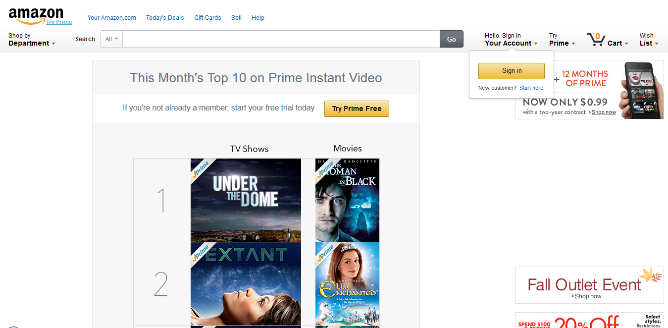
Google’s multiple-site structure lets it neatly avoid the issue.


Incidentally, I’m not the only one to wonder about this. In fact, it’s been talked about for a few years already.


The best answers as to why designers build pages this way include “well, at least the button is in the same place consistently across sites” — which it’s not — and “it’s more important to attract new clients. The old ones know where to look,” which to me, goes right back to my main point that once a service has you — and your information — in its grasp, it’s ready to move on to someone else.


Facebook's Front Page

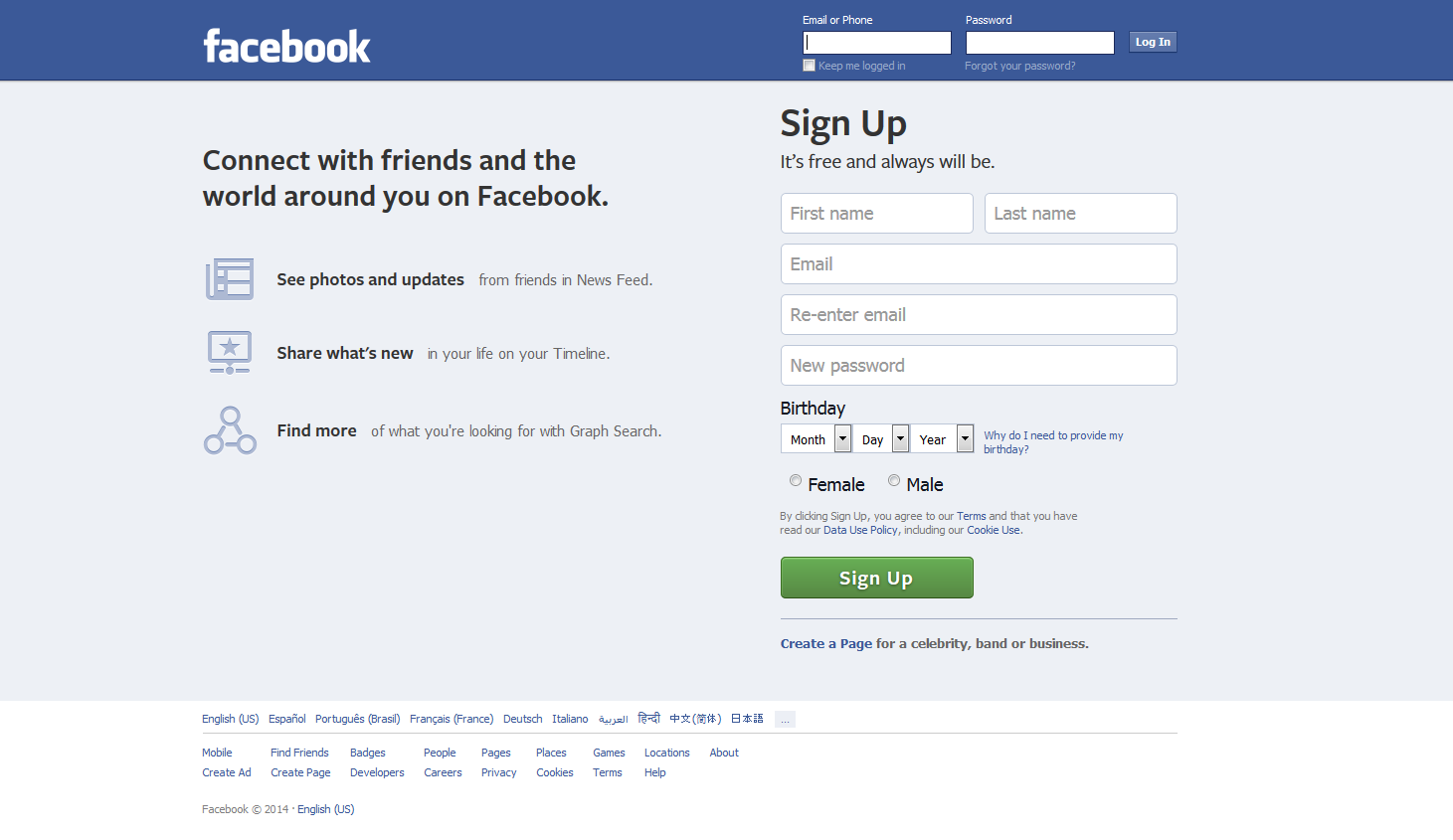
Facebook, however, has long held a middle ground.


If nothing else, it’s food for thought. I will leave you with one more example that I think strikes a nice balance — but of course, their business strategy demands high-rate returns, so where does that leave us? With more to ponder….


Amazon Front Page

Well, I like pondering anyway.

If you want to contact me about this article for any reason, please email me at
martin at mberlove dot com
.
This entry was posted in internet, society and tagged design, internet, layout, login, services, sign in, society, technology, web design. Bookmark the permalink.

Post navigation

« Tangling with Open-Source
Learning Jenkins: Example Projects »
Martin (Chaim) Berlove Martin (Chaim) Berlove
Innovation enthusiast & frustratingly insatiable ponderer. Currently working in technical strategy consulting.

@martinberlove

mberlove.com

GitHub

Recent Posts

  • Cognitive Abstention
  • Learning What to Learn While Learning (What?) — A Lesson in Classic Greek
  • A Short Consideration of the State of U.S. Naval Technology
  • “Task Failed Successfully”
  • Why this job?

Categories

  • book review
  • career
  • communication
  • digital nomad
  • future evolution
  • future of work
  • internet
  • javascript
  • jenkins
  • learning
  • life lessons
  • living
  • mathematics
  • metacognition
  • programming
  • ruby
  • society
  • software engineering
  • software issues
  • solution space
  • technology
  • tools
  • Uncategorized
  • web development
  • work

Archives

  • April 2025
  • February 2025
  • December 2024
  • November 2024
  • October 2024
  • July 2024
  • May 2024
  • August 2023
  • May 2023
  • March 2023
  • February 2023
  • September 2022
  • August 2020
  • March 2020
  • October 2019
  • August 2019
  • July 2019
  • December 2018
  • September 2018
  • June 2018
  • July 2017
  • May 2017
  • April 2017
  • March 2017
  • February 2017
  • December 2016
  • October 2016
  • September 2016
  • August 2016
  • July 2016
  • June 2016
  • May 2016
  • March 2016
  • February 2016
  • August 2015
  • October 2014
  • August 2014
  • June 2014
  • May 2014
  • April 2014

Meta

  • Log in
  • Entries feed
  • Comments feed
  • WordPress.org

© 2014 by Et Cetera / Proudly powered by WordPress / Theme: thebox by design news. / Privacy Policy